





Tool
SpareRoom App · UX Case Study 2026 · Self-initiated concept · 3 weeks
The surfacing of SpareRoom’s hidden viewings calendar
Scroll

 3
3
Viewings


Existing Prototype
Proposed Prototype
Average time taken to navigate to upcoming viewings: ~ 13 seconds
(from home screen)
Average time taken to navigate to upcoming viewings: ~ 2 seconds
(from home screen)
PROBLEM
Low adoption of SpareRoom’s scheduling tool leaves renters coordinating viewings in cluttered message threads. Consequently, addresses and viewing times get lost, scheduling falls through, and planning quietly moves off app.
HYPOTHESIS
There is low adoption of the scheduling tool because it is buried behind too many layers of navigation. Users either never discover it, or find it too inaccessible to use consistently.
SOLUTION
By restructuring the app's hierarchy, the viewings calendar is promoted from a buried feature to a primary surface, anchored on the homepage and navigation bar. The upcoming viewings now become accessible from any point in one click.
about SpareRoom
SpareRoom is a lettings platform for private landlords and renters. A user base once dominated by graduates, now spans professionals and older adults priced into lodging and room-sharing.
The problem
Despite being such a widely utilised app, I have experienced many friends voice the same complaints about its cluttered, unintuitive interface. This prompted me to look closer, and a study of online reviews and discussion threads confirmed the frustration is widely shared:
46%
of recent reviews rate the app 1–2 stars
1–2 stars46.0%
3–4 stars26.0%
5 stars28.0%
Ratings across 100 App Store reviews from 2025-26
37%
of negative reviews cite poor messaging and viewing coordination
Messaging and Coordination issues37.0%
Map issues7.0%
Scam reports21.0%
Other35.0%
Main concerns raised across negative reviews
46%
of recent reviewers are unhappy - Many due to viewings coordinated through scattered messaging threads instead of organised scheduling flows
 CA
Claire A.
Double room in Clapham - Hiya, what is your address again?
CA
Claire A.
Double room in Clapham - Hiya, what is your address again?
 TB
Tom B.
Furnished double room - You: Hey, can we push the viewing forward to 5pm?
TB
Tom B.
Furnished double room - You: Hey, can we push the viewing forward to 5pm?
 LI
Laura I.
Looking for a room with creatives - You: Hey I’m running a little late, would you mind if we...
LI
Laura I.
Looking for a room with creatives - You: Hey I’m running a little late, would you mind if we...
 GS
Georgia S.
Girly flat in Edwardian House - You: Is this still available?
GS
Georgia S.
Girly flat in Edwardian House - You: Is this still available?
 PD
Patrick D.
Searching for double room - Hey Clara, thanks for getting back to me, can we plan...
PD
Patrick D.
Searching for double room - Hey Clara, thanks for getting back to me, can we plan...
 AG
Amy G.
Large double room - You: What time tomorrow?
LS
Lucy S.
Looking for female housemate - You: Hey, what house number are you
AG
Amy G.
Large double room - You: What time tomorrow?
LS
Lucy S.
Looking for female housemate - You: Hey, what house number are you
 SP
Sam P.
Spacious Apartment - Do you still want to view the flat?
SP
Sam P.
Spacious Apartment - Do you still want to view the flat?
 NC
Neil C.
Young professional moving to London - You: Hi, I’m not going to make it to the viewing t...
NC
Neil C.
Young professional moving to London - You: Hi, I’m not going to make it to the viewing t...
user research
To understand whether or not users are aware of the current built-in planner, I conducted an in-person interview with 10 participants from my extended network who have used SpareRoom in the last year (ranging from ages 26-45). The aim was to understand how these users coordinate their upcoming viewings


I’m not sure why they make it so hard to find the viewing calendar. I just use my notes app.

There’s a viewing planner? since when?
I use my notebook to keep track of viewings
It’s hard to keep track of viewings. People forget to reply because your thread is buried under 50 ‘is this still available?’ chats.
0/10
Surveyed participants use SpareRoom’s schedule tool
To understand why the current built-in planner is not used by participants, I conducted a user flow mapping exercise on all participants. Only 1 interviewee knew this feature existed (but does not use it), whilst the others struggled to locate it. The results were as follows:
Average time taken to reach (seconds)
User sentiment
In-app calendar
13

“Where is it?”
In-app messaging
2
“Easy to find but disorganised”
3
“Familiar”
Notes app
4
“Quick and easy”
Notebook
N/A
“Reliable”

In-app calendar takes longer to find than other familiar tools
Existing flow
Where the user experience breaks down:
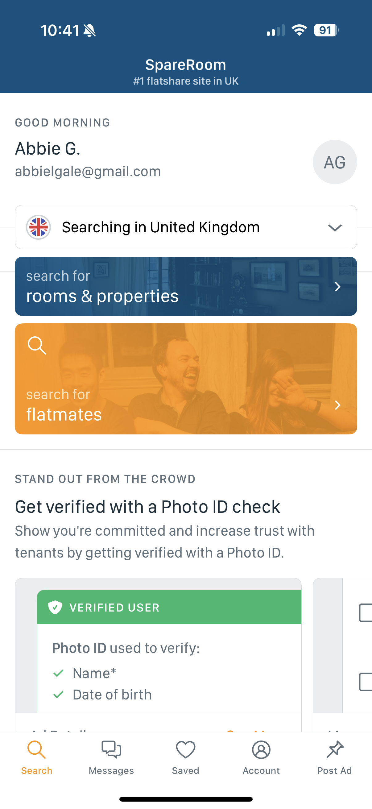
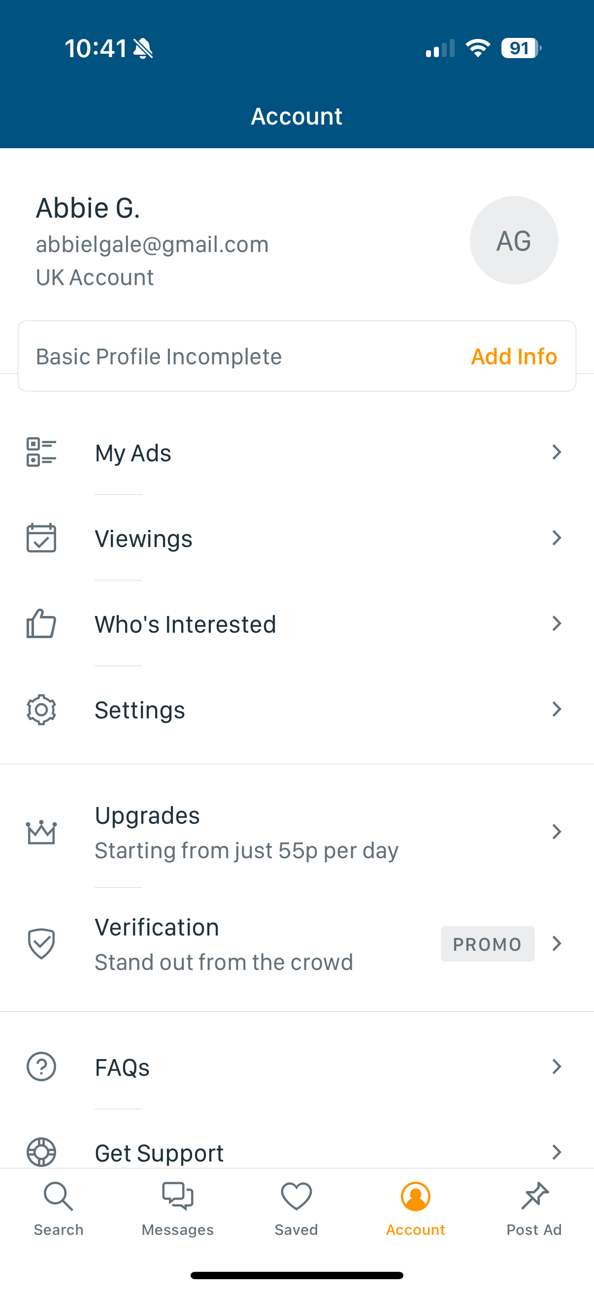

No reference to viewings on home page
No visual emphasis
Viewing planner nested within account information. Seems to have minimal importance
Could feature creep be occurring?
Market analysis
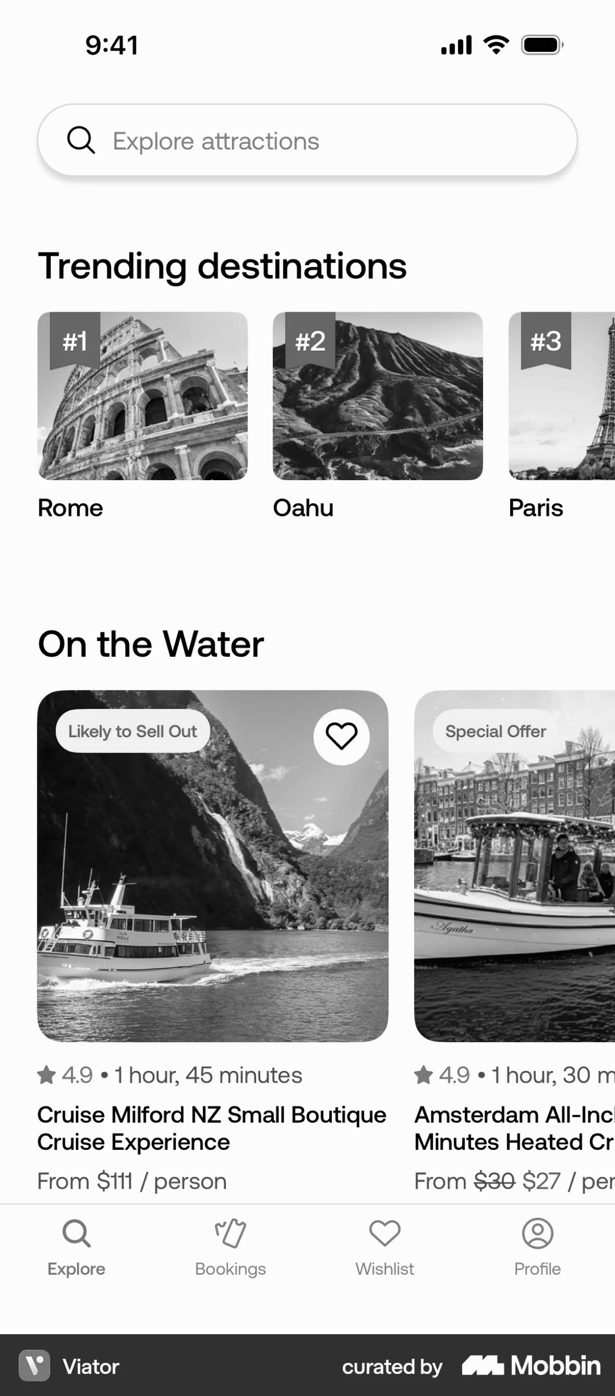
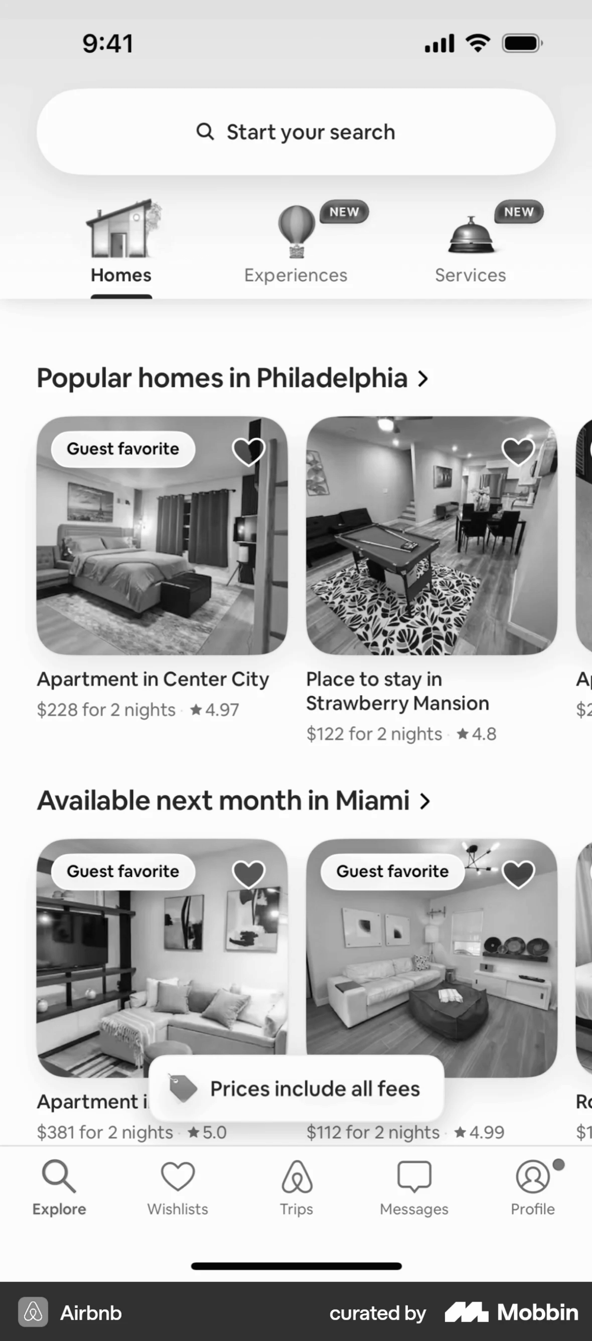
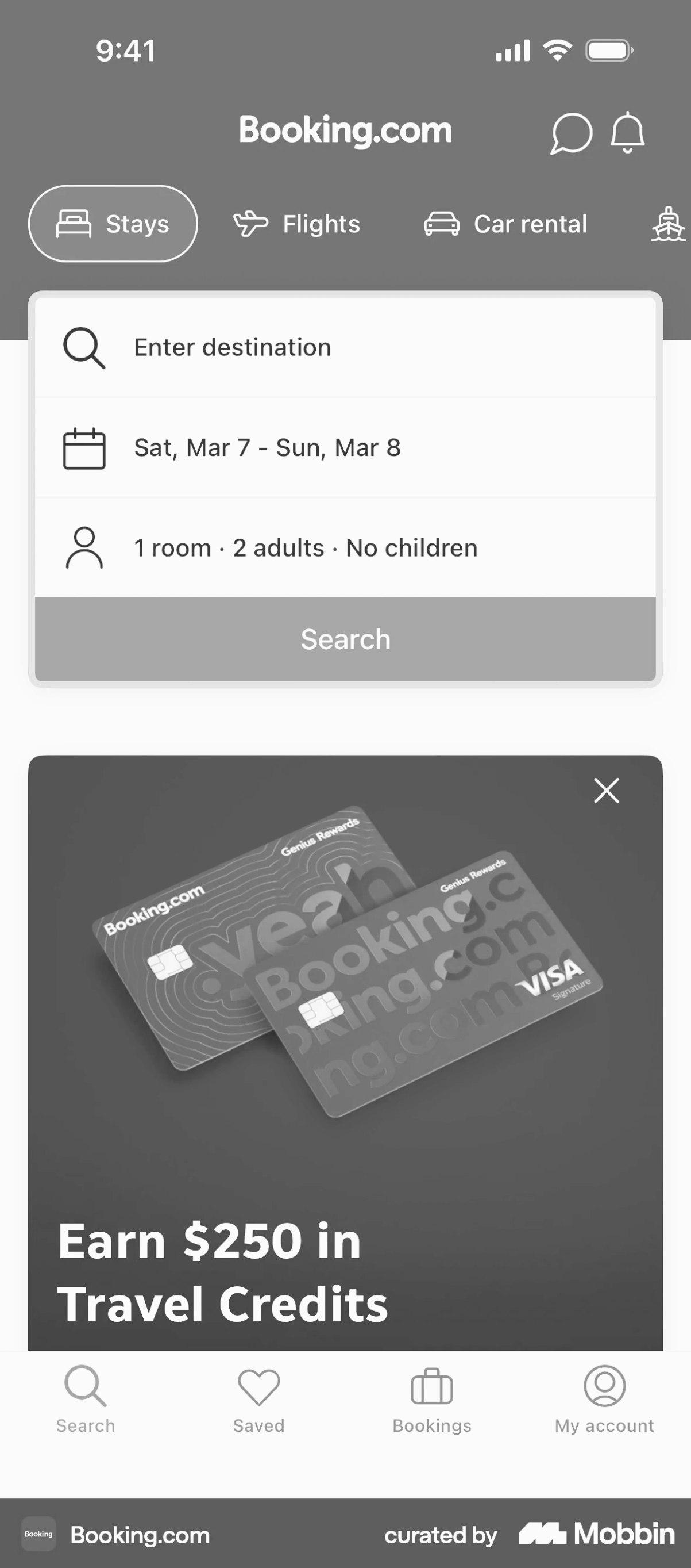
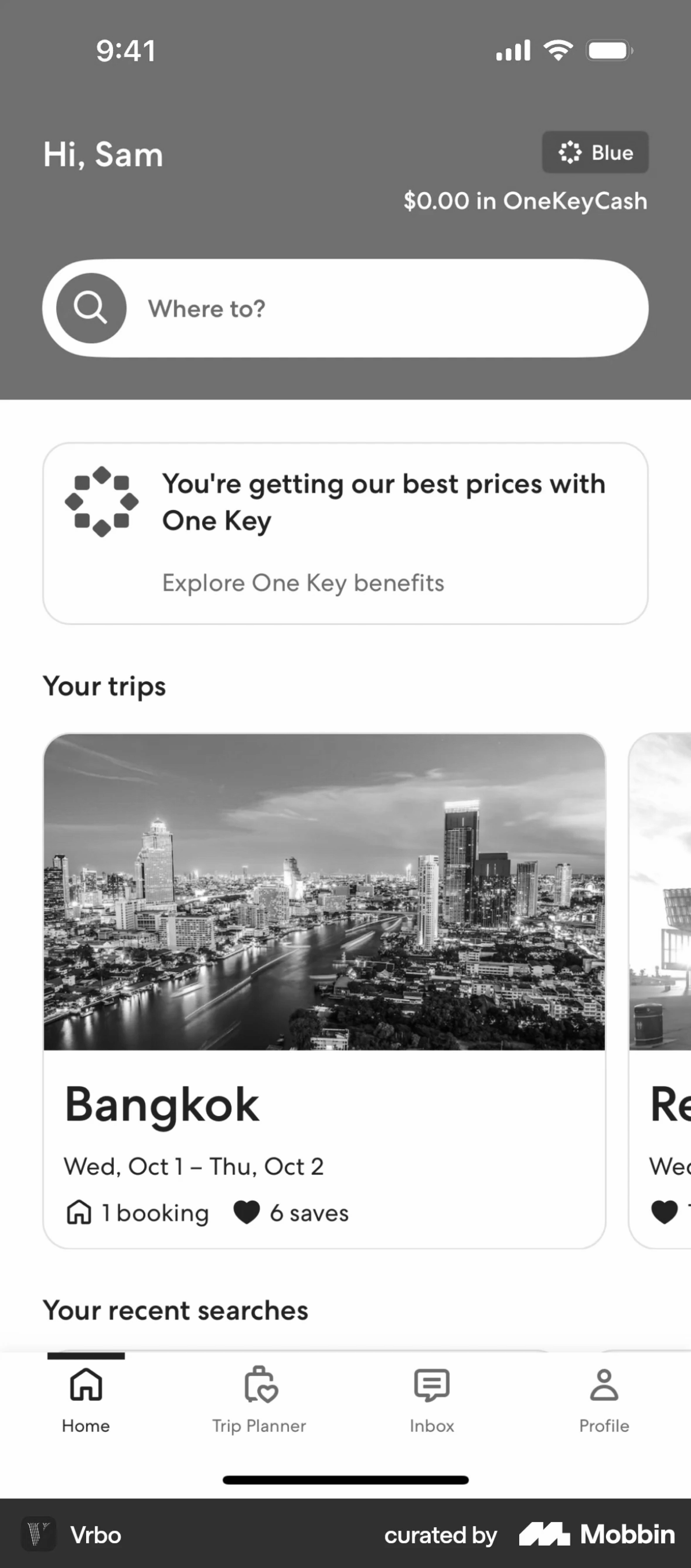
Direct competitors such as Rightmove and Zoopla revealed the same gap as SpareRoom: limited functionality for managing viewings. My research therefore looks at platforms that rely on scheduling as a core interaction, rather than at rental apps alone.
Upcoming bookings
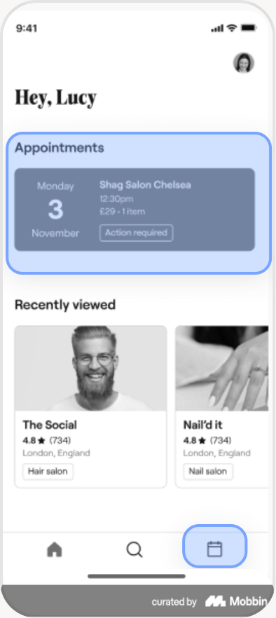
Scheduling icon typically appears on bottom navigation

iteration 1


Account icon moved to top navigation
Viewing planner surfaced to bottom navigation bar
Icons increased in size for greater accessibility, and icon style modified for visual consistency

Issue:
Despite increasing discoverability, feedback and previous research suggests habit may still lead users to revert back to their usual messaging tendencies. More visual emphasis may be needed.
Further analysis
Further analysis establishes a clear pattern: rental apps tend to showcase search, upcoming bookings and discovery content on the home screen to encourage usage.

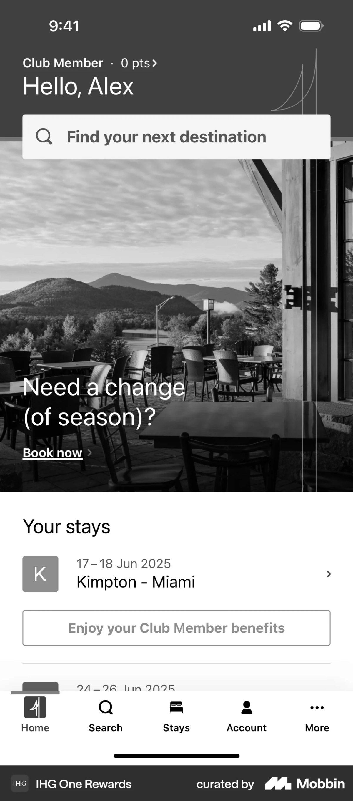
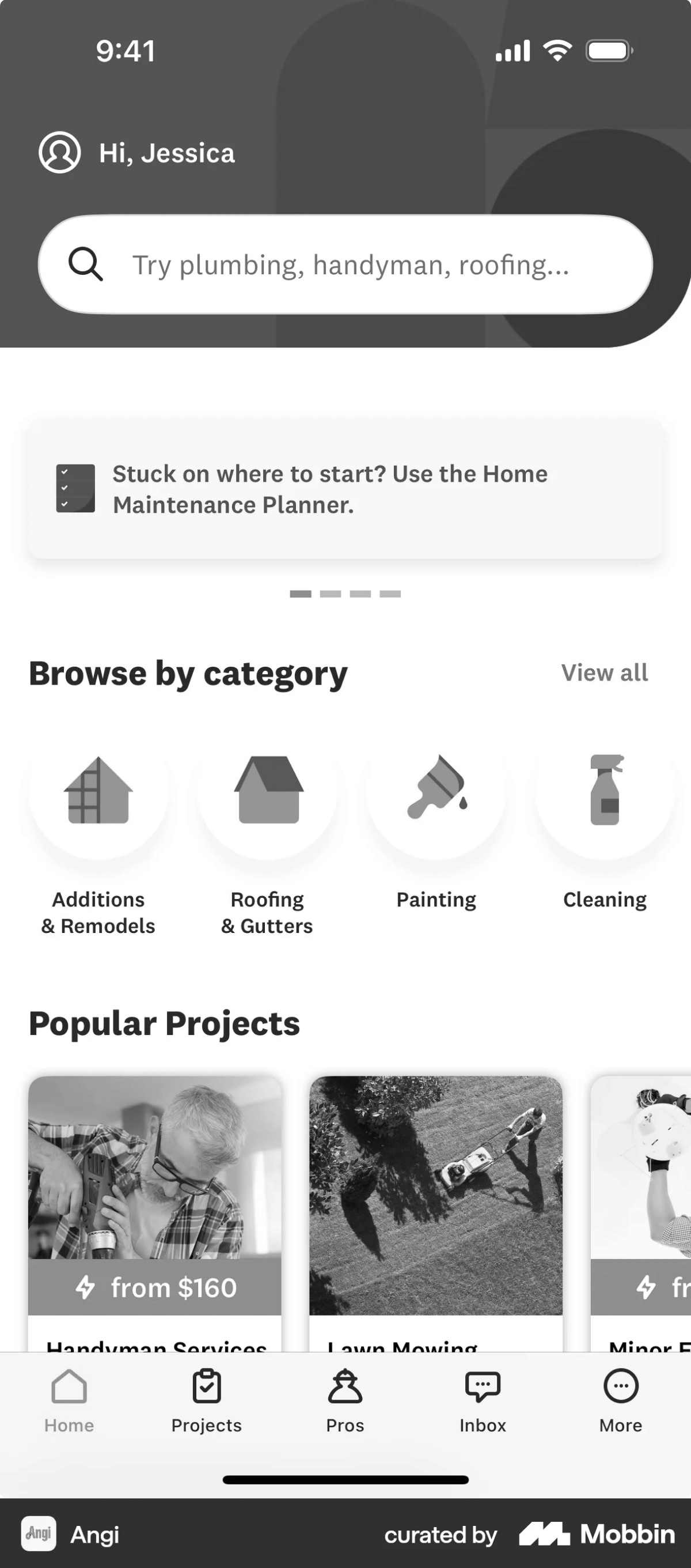
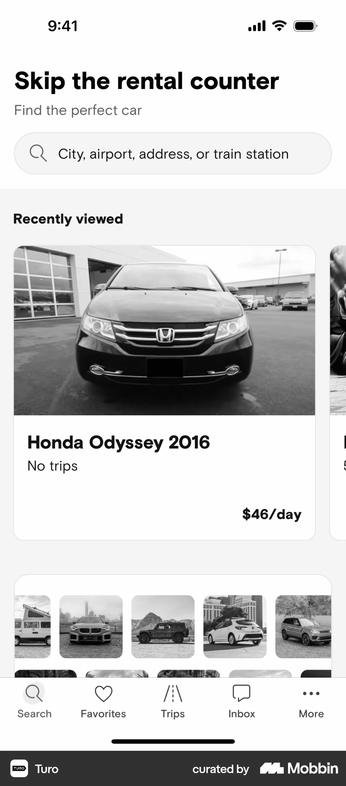
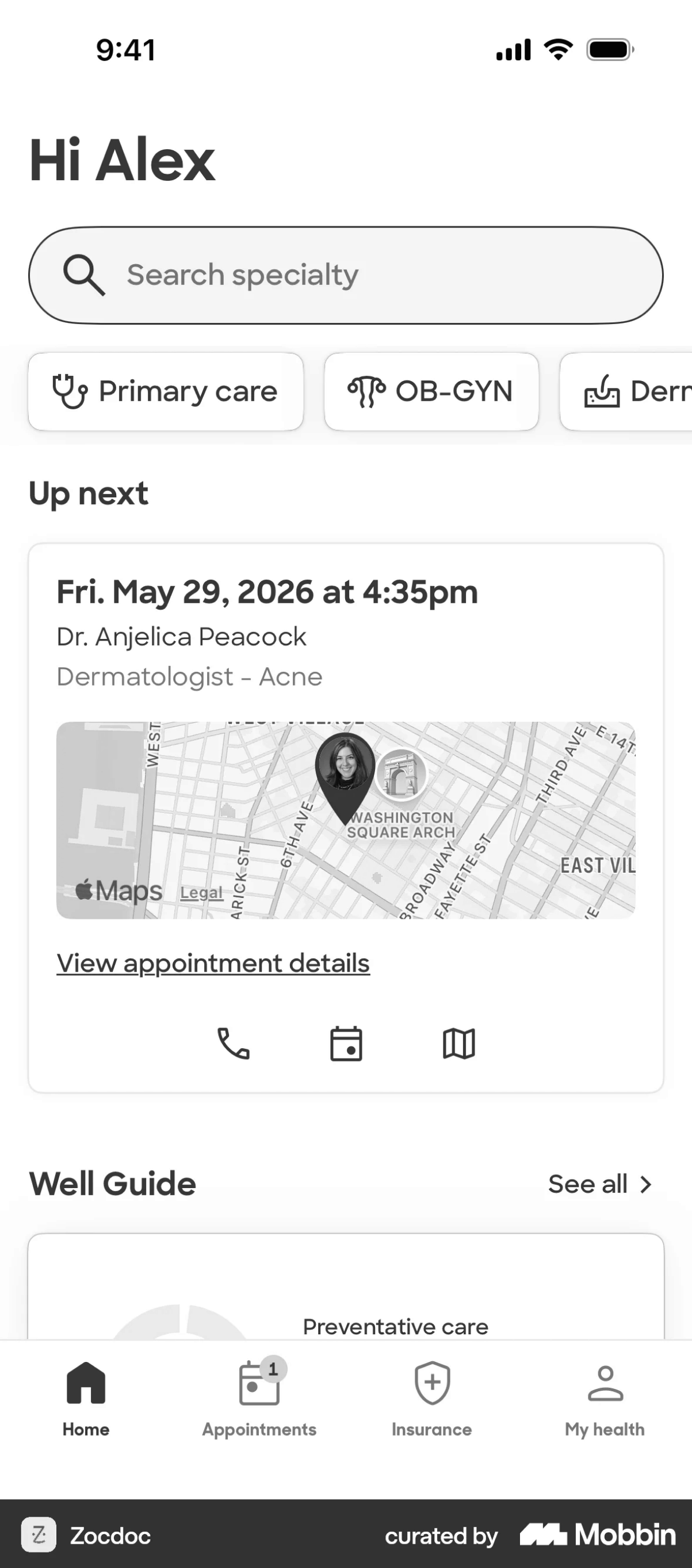
Categories
Search
Filters
Upcoming bookings
Discovery
Map
Bookings
Messages
Reprioritising
the homepage
Separate user flows could be removed from homepage and determined on splash screen. This will provide space for calendar feature.
Can be moved to settings or further down home page
FINAL PROTOTYPE
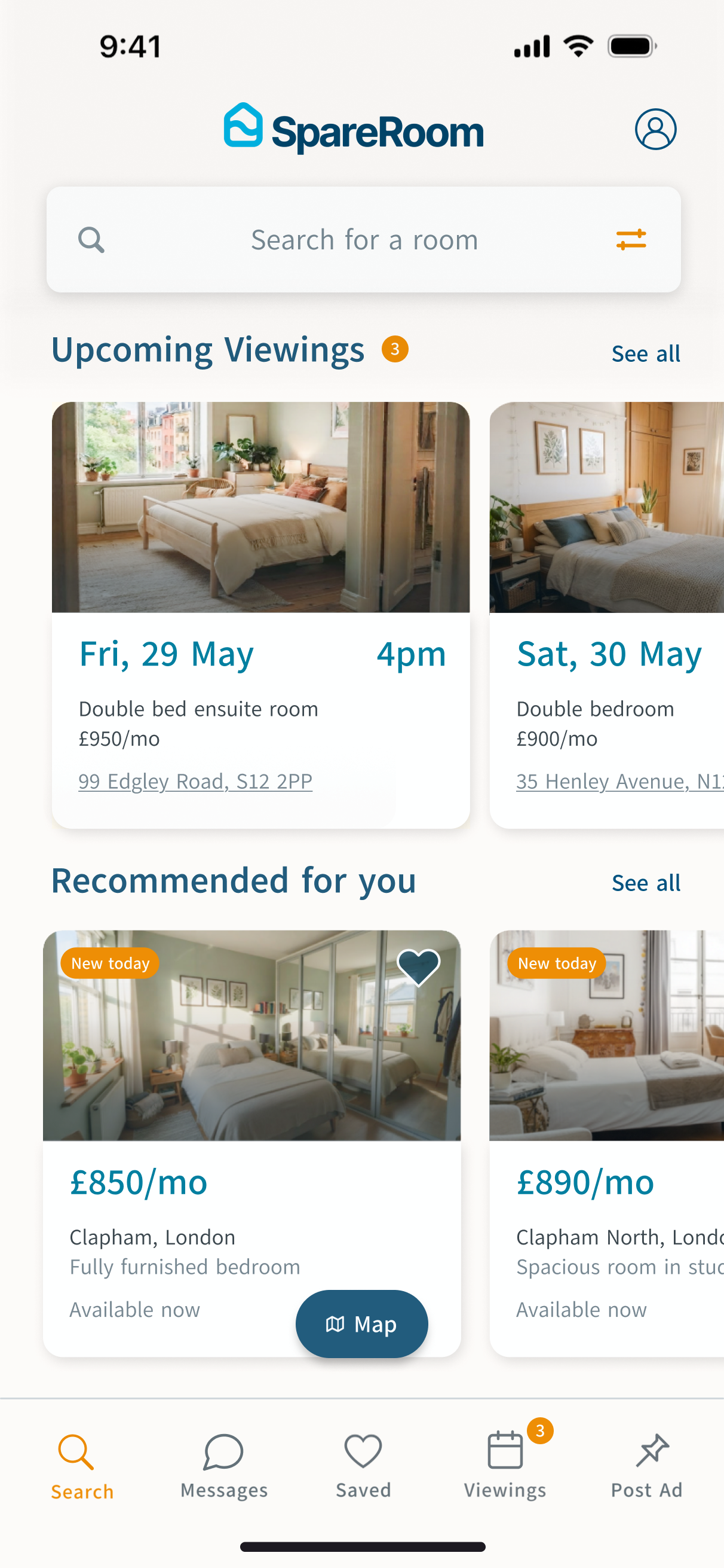
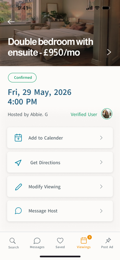
The final prototype promotes viewings from a buried feature to a primary surface, anchored on the homepage and bottom navigation bar


Splash Screen
Dividing user flow
(only appears on sign up)
Home Page
Surfacing Upcoming Viewings
Viewing Planner
Accessed from two locations
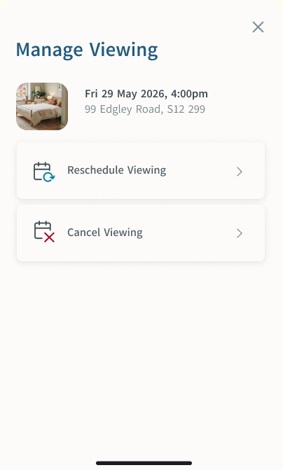
Viewing modification
Easily modify viewings
Viewing modification
Easily modify viewings
Average time taken to reach upcoming viewings planner reduces from ~13 seconds to ~2 seconds (from home screen)
AFTERTHOUGHTS
If this were a live project, to validate my design it would be great to conduct the following
 Heat-map the new homepage to check the viewings card genuinely draws the attention its hierarchy gives it, rather than being scrolled past.
- A/B test the placement of upcoming viewings on the home page and navigation bar to measure which drives more taps.
- Track whether coordination stays in-app
